Glenfiddich Whisky required a visual refresh to change perceptions of their brand. Often perceived as traditional, they were seeking a more luxurious and refined look to better represent their maverick spirit.
This was a large project undertaken with Purple Creative. I helped to develop a new brand world that included initial concept generation and visualisation, then defining and creating the graphic elements that made up the new brand world with supporting guidelines for these. I then showed how all these elements were to be applied across print and digital, beauty imagery, gift packs and 3D environments.
Polkadot is a blockchain platform and cryptocurrency who are the pioneers of Web3. Their aim is to decentralise the web and put the power back in the hands of the user.
Decoded is their annual global hybrid event that brings the community together and empowers them to shape the future of Web3. Over two days, physical events were held in four major cities from Berlin to Buenos Aires with streamed content accessible to the community right across the world.
My role was to develop a concept, core identity and graphic toolkit that could be used by all the different territories to develop consistent communications that would all make sense when viewed together at the event.
The circular elements linked back to the ‘dot’ present in the Polkadot brand creating an ownership for the event. These elements then became a window into an exciting world of content that would combine in unusual and interesting ways. This visually showed the Web3 community and it’s shared ideas coming together in one place.
> Watch overview
M&G are one of the UK’s largest and longest established investment houses. They have a constant need to evolve their brand in order to meet the changing demands of the marketplace and their customers.
I have developed numerous graphic materials to inspire and facilitate different campaigns. These campaigns evolve the brand by creating new assets and visual approaches but also strengthen it by remaining faithful to recognised use of colours and fonts.
The global pandemic of 2020 forced a rethink on how many brands were going to communicate with their audiences in the absence of being able to attend physical events. Ericsson were no different and after cancelling their headline appearance at Mobile World Congress they were looking to connect and engage with their key audiences virtually.
Working closely with Lively, a pitch win led to a year long series of global digital events that all required me to develop unique creative solutions, visual identities, guidelines and strategies that could be delivered and stand out despite huge global restrictions.
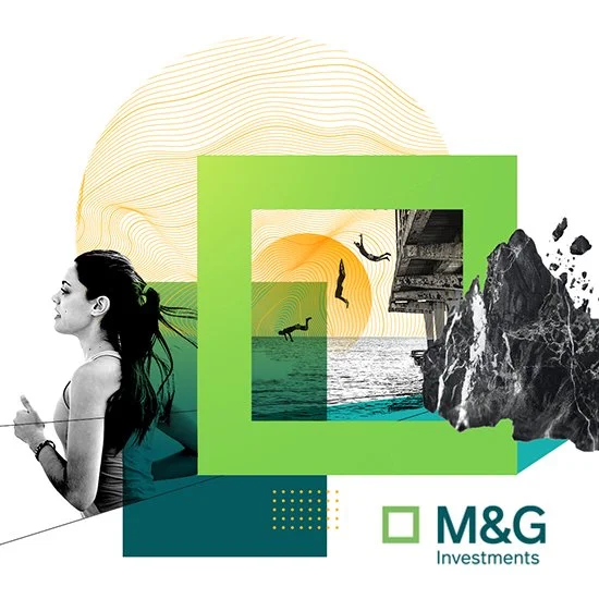
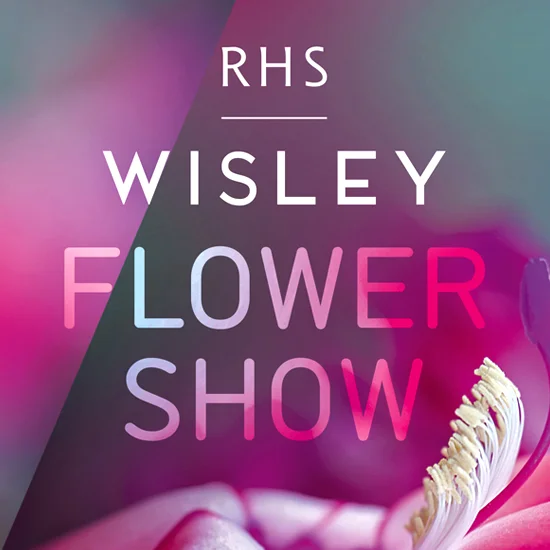
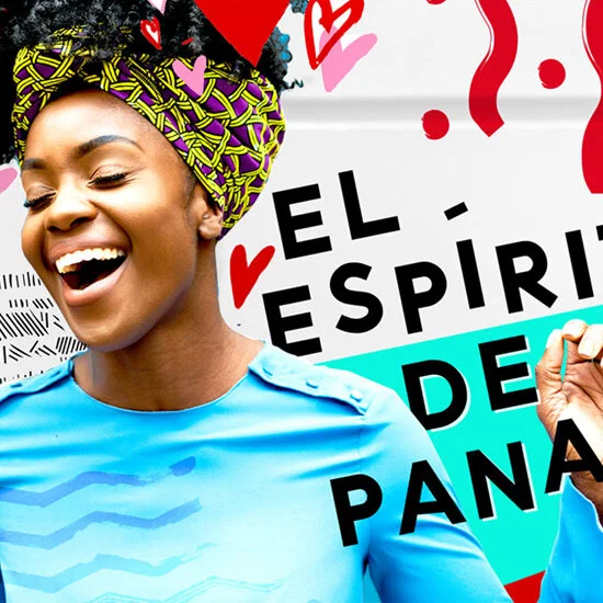
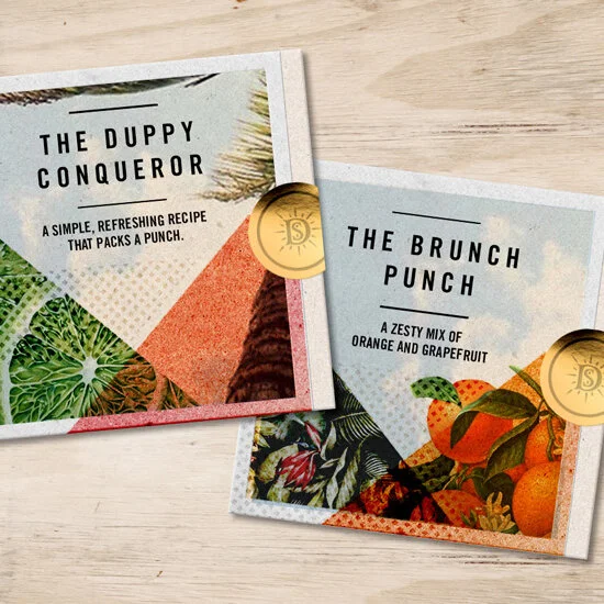
Lively is a new kind of creative agency that can seamlessly deliver live streaming, technology, physical experiences, content creation, digital, social media and campaign strategies that are highly tailored and relevant to many audiences.
I have been working with Lively for many years creating, developing and evolving their brand identity to ensure relevance and standout in the ever changing world we now inhabit.
The identity has been created to convey the agency’s bold and 'lively' approach and demonstrate the company's dynamic energy. A flexible identity system that grows with them as a business into the future.
Bold in colour and simple in design, the identity has been implemented across many company communications including brand guidelines, website, social media channels, credentials documents, case studies, internal events and sub brands.
Asahi Super Dry is Japan’s No.1 beer. It has a complex taste profile which needed explaining to a global audience.
Working with Purple Creative I developed a series of designs that would educate and visually explain the concept of ‘Karakuchi taste’. A taste experience that at once can be both Super Refreshing and Super Dry. As a super premium product, the final look needed to be refined, impactful and deliver clear brand differentiation for Asahi.
The Royal Horticultural Society (RHS) were looking for an updated branding system that would more closely reflect their brand values and promote their Gardens with a consistent visual language.
A variety of logo systems were explored and then applied to various concept posters to demonstrate the breadth of the idea, flexibility of assets as well as the capability to adapt to different seasons.
The designs focused on striking photography and bold typography that reflected the vibrant colours and natural beauty of the plants, trees and flowers that can be found throughout the seasons in RHS gardens.
In this pitch winning response I developed concepts and different visual approaches to promote London Pride in territories outside of the UK.
It was important to communicate the authenticity and strong London heritage of the beer to a younger and more savvy audience. A bold look, refined palette and considered typography all combined to convey a real sense of purpose and confidence.
With Cannes Lions being a key event for the creative industry, Twitter wanted to create a buzz and showcase their LIVE product offering in this unique environment.
After developing a pitch winning response working with the team at Lively, I then led the creative development of all the branding to be used across #TwitterBeach (The main event space on the Croisette) and #TweetSuite (The networking area in a nearby hotel).
As well as designing all the branding, I developed concepts and a style guide for the design of the spaces themselves as well as the individual product demonstration areas to showcase products such as Periscope, Scratchreel and Vines/Gifs.
The core concept was to demonstrate Twitter as the LIVE connection to culture at Cannes - a relaxed space where you could explore your personal passions (music, sport, movies, fashion) and see how Twitter products can connect you more closely to them. Central to this was the Live Studio on #TwitterBeach which created and displayed relevant LIVE content throughout the festival.
Seco Herrerano is an alcoholic drink distilled from sugar cane. It is the No. 1 spirit in Panama, and strongly associated to the nations identity and sense of pride.
I worked with Purple Creative to develop visuals and art directional approaches for a new campaign that captured the energy, passion and culture of the people - ‘The spirit of Panama’.
I produce a lot of mac visuals in my work to realise an idea or concept, whether its at pitch stage or as an integral part of the design process. I'm very experienced in creating core visuals for a campaign or event and then showing how they translate across different media types. I've included some examples here to show the variety of work I can do and also the level of finish I like to achieve.
The M&G garden at the Chelsea flower Show was a vision of a garden created from a disused Maltese limestone quarry. It won best in show and delivered a stern message about the vulnerability of Malta’s natural landscapes and resources.
I designed the supporting graphic identity for M&G that would convey a sense of the key features of the garden and promote it at the show. After developing initial concepts which looked at the geometric and in parts austere nature of the design, a final design was selected.
The approved design utilised the geometric symmetry of the stonework and a visual reclamation of the land by the plants that grew up around it.
The brief was to develop some new identities for the national football teams of Norway and Andorra.
For the Norweigan Football Federation (Norges Fotballforbund or NFF). The new identity needed to demonstrate the strength and unity between all levels of football in Norway from Grass roots through to Semi Professional and Elite. The developed route showcased a 'Uniting Thread' that bound together all elements of Norweigan Football and showed how this collective link promoted strength as an organisation.
For Andorra - a tiny country and a footballing minnow they have limited resources and low recognition in the world of international football. A new identity was required to boost their public profile and to start the process of moving upwards a new crest was developed to appear on the national shirt and ultimately across all of their communications going forward.
Final logotypes, wordmarks and a supporting brand style guide were developed for both projects to set out not just the guidelines of correct usage, but also to inspire future direction.
The brief was to come up with a concept for a large party at the World Mobile congress to be held in Barcelona that would celebrate and showcase the Android brand.
I came up with a concept and name for the event and then designed a visual system to demonstrate how the space would be branded and signposted.
The Android character has quite a quirky personality and it was important that this was apparent in the solution. I came up with the idea of 'Headspace' which allowed the party to focus on all the fun and crazy products and ideas that were going on inside the Androids head.
The signage system was a visual interpretation of that concept whereby a series of hexagons would emanate from the core logo suggesting thoughts of the Android. Through mixing more functional messages with fun quirky ones the identity retained the ability to be relevant, surprising and fun.
After a year-long competitive pitch, iris won the contract to create the London 2012 Olympic and Paralympic mascots – Wenlock and Mandeville. My involvement in the initial pitch was to create detailed visuals to demonstrate how the basic forms of these mascots could be customised to appeal to a wide and varied audience.
Once we had won the pitch I was then fully involved as part of a core team of four to design and create all the mascot assets for use by the London Olympic Committee (LOCOG). The assets were then used across every single Olympic communication relating to the mascots including all the merchandise that was produced.
All mascots were developed to be performing every Olympic sport as well as non-sport, seasonal and celebrity poses in both 3D and 2D vector formats. I also designed the wordmarks 'Wenlock' and 'Mandeville' that accompany each mascot.
As you can imagine, this was a huge project for such a small team to complete and there were lots of unique challenges which meant it took us the most part of 2010. We had a lot of fun bringing the mascots to life and we're extremely proud of what we've created.
I have shown Wenlock here - please refer to the menu to see Mandeville versions.
After a year-long competitive pitch, iris won the contract to create the London 2012 Olympic and Paralympic mascots – Wenlock and Mandeville. My involvement in the initial pitch was to create detailed visuals to demonstrate how the basic forms of these mascots could be customised to appeal to a wide and varied audience.
Once we had won the pitch I was then fully involved as part of a core team of four to design and create all the mascot assets for use by the London Olympic Committee (LOCOG). The assets were then used across every single Olympic communication relating to the mascots including all the merchandise that was produced.
All mascots were developed to be performing every Olympic sport as well as non-sport, seasonal and celebrity poses in both 3D and 2D vector formats. I also designed the wordmarks 'Wenlock' and 'Mandeville' that accompany each mascot.
As you can imagine, this was a huge project for such a small team to complete and there were lots of unique challenges which meant it took us the most part of 2010. We had a lot of fun bringing the mascots to life and we're extremely proud of what we've created.
I have shown Mandeville here - please refer to the menu to see Wenlock versions.
Les Mills Live is a mass participation fitness event and global tour that celebrates the latest fitness trends and cutting edge music.
A set of guidelines were needed that would creatively inform the design and production of the London event.
The guidelines were developed to ensure consistency with the overall brand, maximise the use of approved assets and make it uniquely tailored to the London venue.
The creative challenge was to strengthen Sony Ericssons association with music to a youth audience whilst promoting their Walkman handset range.
I worked alongside an Art Director and Copywriter to develop the concept of Music Monster - everyone has one inside them, a broad mix of unique musical influences, but what does yours look like? Consumers were invited to create their own Music Monsters and then share them with others.
The idea was a hit with consumers and became the creative thread bringing together all their music related youth communications for that year – from the Monster Tent at O2 Wireless music festival through to print, online, TV and retail.
..................................................................
Cannes Lions - Shortlisted
Campaign BIG awards - Shortlisted
This campaign for Marmite went live at election time and played on the rivalry between two fictional parties – The Love Party and The Hate Party. The brief was to support the ATL campaign and produce a door drop for both parties and a supporters pack for The Love Party.
I worked alongside a creative team and when the concepts were agreed I directed the shoot for both the party leaders and developed the designs for all the materials. The Love Party communications were printed on tactile recycled stocks whilst those for The Hate Party had a distinctly environmental unfriendly glossy feel to help reference the relative values of each party.